WELCOME TO AN EXPLORATION
INTO A PREMIUM & CRAFTED
GINGER BEER PACKAGING CONCEPTS
Dear Andre and Ian,
Welcome to the packaging presentation for Natural Drinks Premium Ginger Beer.
In this presentation you’ll find two conceptual name directions, Lazy Fox and Pointers Mark, each crafted to bring the brands vision to life in a unique way.
Every route draws from the approved authentic craft stylescape, balancing bold character with honest, considered design. From laid-back charm to confident heritage cues, these concepts are designed to connect naturally with today's discerning ginger beer drinker.
Enjoy the presentation, we’re excited to share the journey so far.
THE APPROVED CREATIVE LANDSCAPE

ROUTE 01

Lazy Fox captures modern craft with laid-back confidence, stripped-back yet layered, and full of considered charm.
The linocut-style fox strumming its banjo is central to the identity, bringing character and craft without feeling rustic. It’s playful yet curated, perfectly expressing the brand’s easygoing spirit.
A rich terracotta brand palette, inspired by Negroni’s bold tones, anchors the label in a standout colour, vibrant, social, and naturally refined.
The typography is intentionally played back, using classic "craft" typographic styling and placement to create the feeling of a nostalgic label design whilst doe in a modern way.
This is a design made for modern occasions.
Cool yet welcoming, crafted yet unpretentious.

ROUTE 02
The Lazy Fox label was crafted to deliver immediate shelf standout while establishing a bold and memorable masterbrand identity.
Rooted in authentic craft cues, the design balances nostalgic charm with contemporary confidence. The distinctive circular badge format and earthy yellow palette immediately attract attention, offering warmth and approachability without sacrificing presence. Bold, condensed typefaces anchor the outer ring, ensuring clarity and strength from a distance — essential for retail visibility.
At the heart of the label, the linocut-inspired fox brings personality and wit, positioning Lazy Fox as a brand with attitude and easygoing charm. This character-driven centrepiece elevates the label from functional to iconic, forging emotional connection and brand recall.

ROUTE 03
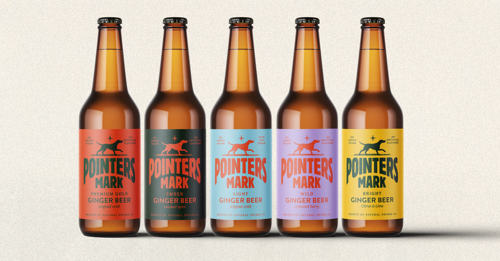
With Traditional typography usage but constructed in a modern and contemporary way, this label pairs authenticity with modernity.
We created a curved, robust wordmark that gives the design a distinctive, ownable presence, nodding to vintage signwriting while feeling fresh and contemporary in its pared-back, tone-on-tone palette.
At the heart of the story is the pointer dog is a symbol of instinct, loyalty and legacy. These dogs, adopted by the brewery’s founder at the very beginning, have journeyed alongside the company, becoming emblematic of its spirit. This design captures that heritage with understated confidence, ready to mark its place in the modern craft scene.

LINEUPS
ADDITIONAL MUSINGS


