WELCOME TO
KIONI
The Branding Presentation
This presentation marks the first creative phase of the branding process, where strategy, emotion, and intention begin to take visual form. Rather than arriving at a single solution immediately, we explore three distinct creative directions, each offering a unique perspective on the brand’s potential identity and world. These routes are not final outcomes, but thoughtful starting points designed to spark conversation, uncover resonance, and guide us toward a refined and intentional final direction. As you move through each concept, we invite you to focus on what feels most aligned emotionally, visually, and intuitively, as these insights will shape the next phase of development and help bring the brand to life in a way that feels authentic, meaningful, and considered.
Route One
In this creative direction, we wanted to explore a typeface that still feels familiar to the current brand, as I believe the existing logo already works beautifully. It feels strong, modern, and complements the intricate beadwork and creativity of the products really well. The logo itself is clean, refined, and sophisticated, allowing the craftsmanship to take centre stage.
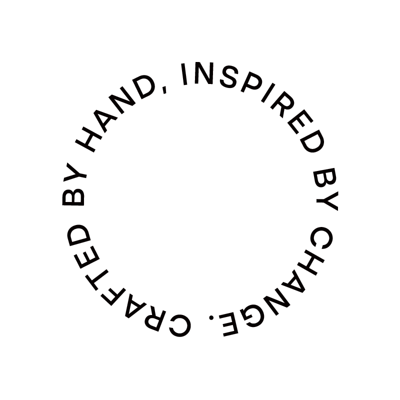
To bring a more human and personal feeling into the identity, we paired the logo with a handwritten slogan that reads, “There’s a story in every bead.” This helps reinforce the heart behind Kioni and the people connected to every piece created.
The colour palette is softer and more muted, inspired by the tones found within the products themselves, while still feeling elevated and distinctly African. We also introduced a beautiful headline typeface called Span, paired with the handwritten script that can be used throughout the brand for little notes, messages, and thoughtful details across different touchpoints.


Route Two
In the second creative direction, we again explored an evolution of the current logo, as the existing identity already feels strong, bold, and very ownable. For this route, we refined the typeface with subtle detailing while keeping the distinctive “X” element, now rotated slightly to create a sense of movement and energy.
This direction is heavily inspired by African shapes and patterns. We mirrored the “K” to create a symbolic icon that represents community, creativity, and the spirit of Kioni. We also introduced a supporting lockup that reads, “Handcrafted by Women of Africa,” which would accompany storytelling around the women behind the products across different brand touchpoints.
The colour palette is soft and muted, inspired by African tones and the products themselves. Paired with bold typography and expressive shapes throughout the layouts, the overall direction feels striking, crafted, and beautifully African.


Route Three
In the final creative direction, we wanted to explore something slightly different while still keeping the brand feeling refined and sophisticated. We chose a more classic typeface and introduced subtle design details within each letterform to bring through the richness of African culture and pattern work in a more expressive way. The result feels full of personality while still remaining elegant and premium.
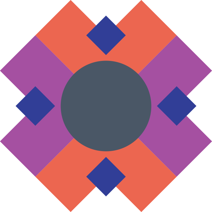
To complement the logo, we introduced a series of soft, colourful shapes inspired by the patterns and textures found within the products themselves. The colour palette is muted yet rich, drawing inspiration from African landscapes, materials, and artistry.
Overall, this direction feels creative, sophisticated, and highly considered, using generous negative space and thoughtful layout design to create a more elevated and luxurious brand experience. The packaging especially allows the identity to come to life in a very beautiful and expressive way.


Thank You