WELCOME TO THE ARCHITECH
BRANDING PRESENTATION
Thank you for the opportunity to collaborate on this visionary project. We are truly grateful and have thoroughly enjoyed the creative process of bringing Architech’s essence to life.
In this presentation, you will find two distinct creative routes, each crafted to reflect the core of Architech’s mission—transforming complex data into clear, actionable knowledge. Inspired by the Archimedean spiral, these concepts embody the journey of distilling intricate information into structured clarity, mirroring the natural progression from complexity to comprehension.
Both directions offer a unique perspective, and we encourage you to explore them with an open mind. Elements from each can be blended to create a bespoke identity that fully encapsulates your vision. Our goal is to provide a foundation that not only resonates with your brand’s purpose but also evolves as Architech grows.
Enjoy the journey!
Route One
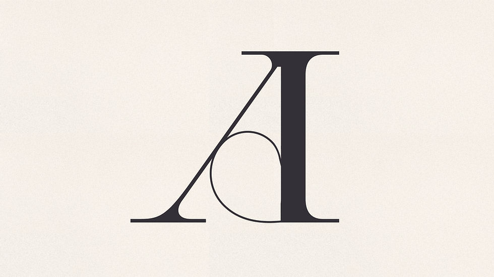
The challenge with the initial logo concept was that the integration of spirals within the letterforms, while visually engaging, introduced a whimsical quality that lacked the gravitas of the great mathematicians who first explored the Archimedean spiral. By refining the approach and stripping back unnecessary elements, this route embraces a more sleek and sophisticated aesthetic. A timeless serif typeface pays homage to the elegance of mathematical precision, while modern secondary typefaces bring a contemporary balance, ensuring the brand feels both intelligent and forward-thinking. This direction aligns seamlessly with the vision and references provided, creating a refined yet powerful identity for Architech.


Route Two
This route takes a bold, modern, and minimal approach to brand identity, with strong typography serving as the foundation for a distinctive and refined icon. The icon is crafted from precise geometric elements, subtly incorporating a protractor-inspired ‘A,’ the balanced proportions of the Vitruvian Man, and the fluid motion of the Archimedean spiral. A continuous circular keyline weaves throughout the branding, creating a cohesive visual language that reinforces the brand’s precision and clarity. Paired with sleek, contemporary typefaces, this approach establishes a striking yet understated identity that feels intelligent, structured, and forward-thinking.


